


Charlotte & Kelly Picard's Xmas Card Photo
Welcome to our online store and blog.
Each week we give you a behind the scenes look into the people places and cultures that inspire our brand. Travel is a key part of why we love our company so much as we get to work with artisans from all over the world while eating and sleeping our way throughs the countries we visit for work and pleasure.
This week we share our ponderings and amusement of our dear friend Charlotte Picard's annual Xmas Card.

Ahead of the Curve, in White
When we returned from Italy—sun-kissed, jet-lagged, and still dreaming in shades of Salento stone—there it was in the mail: the Christmas card. Thoughtful. Graphic. Quietly confident. So unmistakably Charlotte.
Our friend Charlotte Picard, formerly the head of Art Direction at Doyle Auction House in New York, has always had that uncanny ability to see what’s coming before the rest of the room does.
After many years at the helm of one of the most respected auction houses, Charlotte gracefully pivoted—now lending her sharp eye and formidable intellect to help her handsome husband (I/we introduced them) build his company, all while continuing a personal tradition we look forward to every year: sending the most creative, forward-thinking Christmas cards.

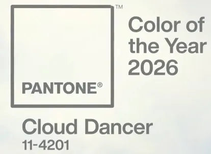
This year’s card stopped us in our tracks. A study in white—pure, luminous, intentional. And here’s the thing: months later, Pantone would announce their 2026 Color of the Year: Cloud Dancer—essentially, white. Charlotte had already arrived there. Long before the reveal.
That moment sent me down a rabbit hole, pondering the cultural and emotional significance of white in the modern age.
In Western traditions, women wear white to marry—largely a legacy of Queen Victoria in 1840—where white came to symbolize purity, new beginnings, and, at the time, status. Yet historically, brides wore many colors; white was less about romance and more about meaning and means.

Washi Paper Incense #4 Mellow Grove
In India, the symbolism shifts entirely. White is worn at funerals, particularly in Hindu and Sikh traditions, where it represents purity, peace, detachment from the material world, and the soul’s journey toward liberation—moksha. Death is not an end, but a transition. White honors that passage with simplicity and spiritual clarity, while black is often considered inappropriate.
Two cultures. Two rituals. One color. Infinite meaning.

At Thomas Fuchs Creative, this philosophy of neutrality-as-power has long informed our work. Our Silver / Grey Half & Half hand-dipped dinnerware collection was created as a calm, grounding base—a neutral palette that still feels special and collectible. While we change colors season to season, Silver/Grey remains a constant. A foundation.
Thomas often says that white is not the absence of color but the presence of light—because white light contains the full spectrum. Black, by contrast, is the absence of light. Coming from a life steeped in richly colorful cultures, I believe in white as the ultimate base layer: a primer that allows every hue to sing louder, truer, and more joyfully.
Click Above Instagram Image to View Video
So as we step into a new year, inspired by Charlotte’s quiet prescience and a simple white card that said everything without shouting—here’s our wish:
Paint your walls white.
Prime your life with light.
Then add as much color as your heart desires.
And in the meantime—set the table with something timeless THOMAS FUCHS SILVER GREY MELAMINE DINNERWARE. ✨
Leave a comment
This site is protected by hCaptcha and the hCaptcha Privacy Policy and Terms of Service apply.